After downloading Adobe’s free trail for Illustrator, i started experimenting with the pen tool to get the feel of creating smooth curves before i started the real poster. I started to draw Darth Vader/ Luke Skywalker, splitting their face in the middle in order to present them as the same person. I feel like i successfully created a simplistic vector image which resembles the characters well.  I then went on to look at online tutorials on image tracing on Illustrator and how to convert images to editable vectors, as this would be needed to help me create some of the Star Wars character representations. I found the blog post by Terry Hemphill (2013) to be the most useful as the easy step by step guide made it clear why and what was needed to be done to create your desired vector image. I will carry on drawing out each character, and placing them accordingly onto the page, the ‘good’ side (left) or ‘bad’ side (right), linking the characters to correspond to their relationship status with one another. http://blogs.adobe.com/adobeillustrator/2013/07/image-trace-in-illustrator-a-tutorial-and-guide.html
Month: December 2014
Development and Realisation (Planning) – Colour
Development & RealisationAs previously discussed in a blog post, in order to take an effective flat design approach, bold, vivid colours will be needed. There are many websites such as http://flatuicolors.com/ which have a library of colours that i may want to use for my poster, you are also able to click on your desired colour to copy the various codes into Adobe Illustrator.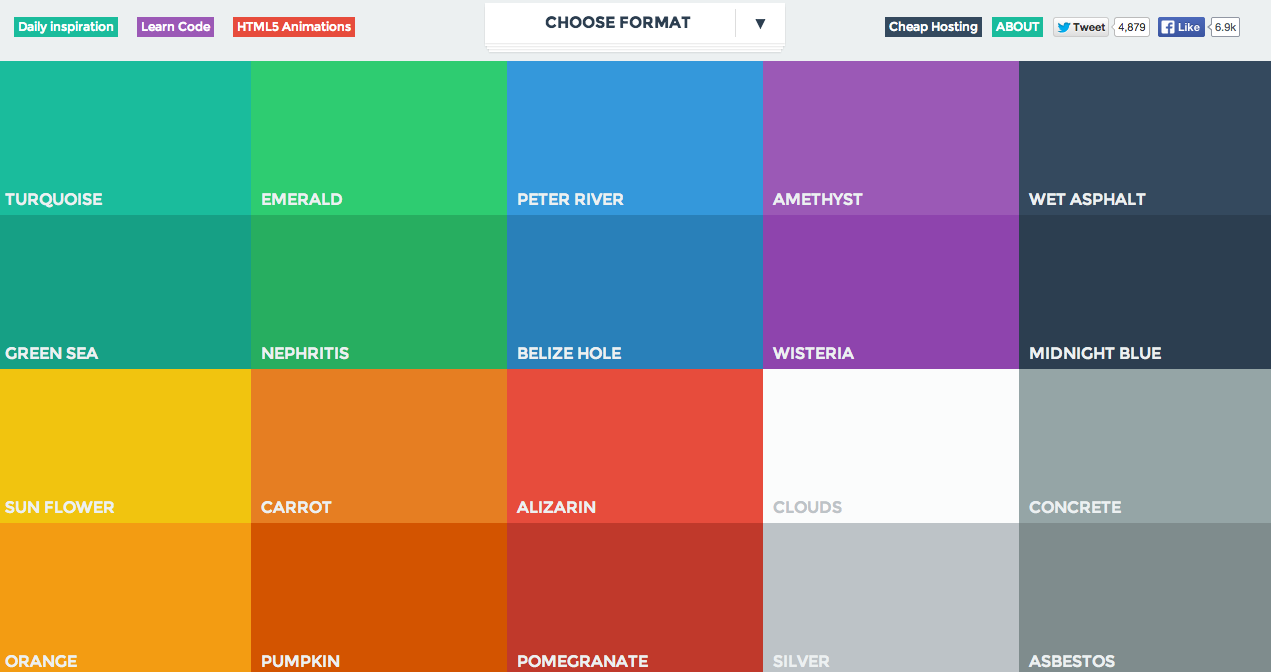
However, even though i want to follow this approach, i do want to stick with a Star Wars themed palette as it will help anchor the data being presented. As discussed in a lecture, colour can help to highlight and accentuate specific data and cultural influence. For example, yellow stands for cowardice in the west but in japan it means courage-
cowardly lion in alice in wonderland via brave pikachu in pokemon. As i want my audience to easily recognise my poster is associated with the Star Wars franchise i decided to use Tineye labs – Colour Extraction, to extract the colour palette used in a widely know Star Wars poster, this not only giving me the hex number as well, but showing the percentage of area that colour is present.  As you can see from the image above the most dominant colour is dark blue. This is probably due to it helping to emphasise the foreground imagery such as the lightsabers and the main protagonist Luke. It also resembles space and the ‘evil’ around them without going too dark with black for example, which wouldn’t be particularly interesting or eye catching. This is something i could take on board when deciding on my background and trying to make my icons bold and eye catching. Tineye Labs also had another feature where you can search the colours to see other images with similar colour palettes. This helped to see what colours complimented each other well.
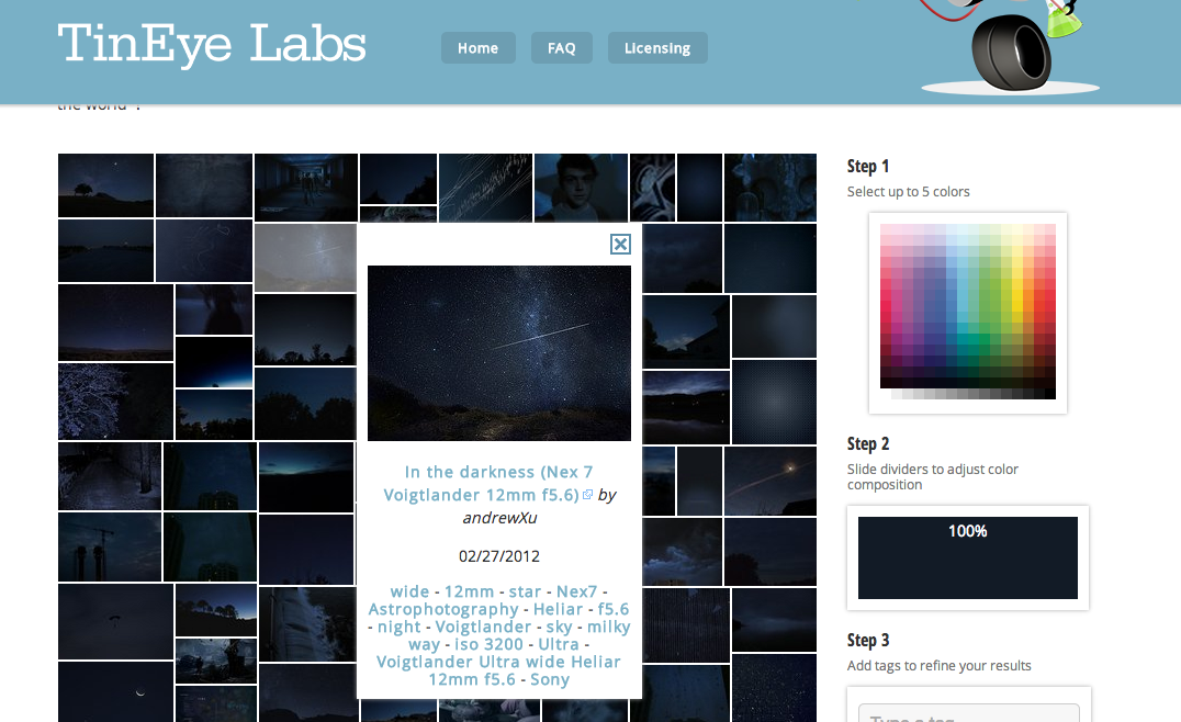
Development and Realisation (Initial Development) – Designs
Development & RealisationAfter looking at imagery i’ve decided to now create a couple of simple designs based on layout and composition for my infographic. After recent lectures on representation where we learnt about form, visualisation, colour and structure i came up with my first design influenced by Gestalts principle of proximity.  In an article Sarah Mae Sincero explores how the law of proximity states that humans perceive stimuli that are close to each other by grouping them and recognising them as part of the same object. Meanwhile, stimuli that stand far from one another are part of two or more different objects. The distance that defines how close or far the stimuli are from each other is subjective to every individual. At first i thought i could design 2 separate objects placed apart, which are made up of the minimalistic head representations of various Star Wars characters, 1 object being made up by the ‘good’ characters and the other ‘bad’. This showing which characters are enemies. As within the two groups the characters would be placed so close together we would however perceive them as a mass and when looking at the brief i felt this idea wouldn’t satisfy it, as other relationships weren’t being explored. When developi
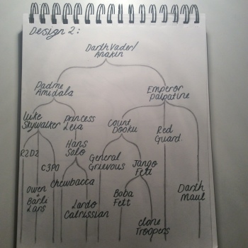 ng this idea and thinking about how the use of space could imply a certain emotion i came up with my second design. I thought the amount of distance between each character could resemble how close they are. For example, Princess Leia and Hans Solo would be placed near each with not much of a gap due to their relationship status. The layout would look like a basic family tree, meaning
 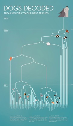 easy understanding however, as well as showing how characters are linked space can give an insight on how positive and strong the relationship was. Anna Katharina Reinbold (2013) took a similar approach when designing ‘Dogs Decoded’. However, rather than using space to present an abstract ideology, it shows the time shift from the evolution of wolves to ‘our best friends’. The incorporation of two data presentation methods into one infographic poster adds engagement and depth; i hope to incorporate this into my final piece. When looking into the main characters in Star Wars i came across an online game where you can guess how many lines each character says.
 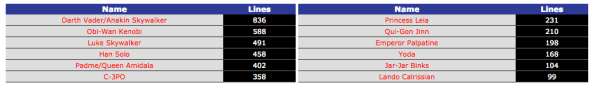 http://www.sporcle.com/games/henandluke/SWcharactersbylines This gave me an idea of somehow presenting which character is most important as well as their relationships. Considering the previous research into composition and use of space, i decided to alter the dimensions of each character graphic depending on their importance and amount said during the films. The research above would help me to compose this fairly accurately. As Darth Vader/ Anakin Skywalker has the most amount of lines in the movies the size of that icon will be the largest, possibly with the other characters branching out.
 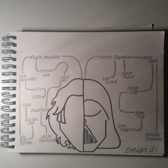 I feel there are positive features in each design and i will try to incorporate them in order to create an effective and professional infographic poster which appeals to a younger audience. Sincero. S. 2013. Gestalt Laws: Similarity, Proximity and Closure. https://explorable.com/gestalt-laws-similarity-proximity-and-closure
Development and Realisation (Research and Planning) – Mindmap
Development & RealisationIn preparation for the creation of my infographic poster i needed to do some research into my chosen subject and gather the data i will be presenting. As i chose the brief requesting the information on who knows who and how in Star Wars, due to personal interest and knowledge, i thought it would be good to start by looking into who the main characters are and how they know one another. I decided to present this as a mindmap in my sketch book for future reference when creating my poster. I need to account for the number of characters included when considering space and poster layout.  Here you can see i’ve tried to incorporated Harry Beck’s concept of creating a full system map in colour. We were introduced to the idea of the London Underground map being a ‘masterpiece of design’ (Carrier, 2007) through the presentation of complex data in a lecture. I was intrigued by this approach and decided to do some further research into the design. It occurred to Beck “that it might be possible to tidy it up by straightening the lines, experimenting with diagonals and evening out the distances between stations.” His ‘diagram’ is instantly recognisable and copied across the world due to making the system modern, quick, efficient easier to navigate. Many would say Star Wars is complicated to understand due to the sheer amount of characters and creatures, i aim to simply show characters relationships for my target audience through the use of this concept studied in my infographic poster. Below is a picture of Beck’s Underground Map from 1933.
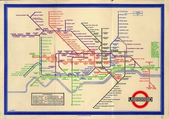
Carrier. D. 2007. ‘Harry Beck and London’s iconic tube map’. Time out London. http://www.timeout.com/london/things-to-do/harry-beck-and-londons-iconic-tube-map-1
Development and Realisation (Research and Planning) – Doodles
Development & Realisation

Whilst researching into existing Star Wars infographics and minimalistic character representations i came across two talented designers. Grégoire Guillemen’s famous capsules proves that you can easily and effectively portray characters or any other cultural icon with the use of a few simple shapes and colours. All of his work under this project is easily recognisable and simple, however, it’s unique and eye catching due to the use of bold, solid colours and sharp, defined outlines. As Star Wars is such a renowned franchise, following this path should be fairly successful as the characters are iconic and well loved enough to be easily recognised.
 Similarly with Joe Stone who has in fact created a Star Wars infographic poster following a very similar approach; focused on creating minimalistic character designs to allow the audience to know which character it is but not over doing it with unnecessary detail which will draw the attention away from the data being presented. I aim to do something similar to Joe Stone as it looks professional and is influenced by the approaches i aim to follow however, it may be too cluttered and confusing for a younger target audience. Therefore, i think i may reduce the number of characters and try experimenting with the layout and space for it to be as easy to understand and as systematic as possible. Below i have done some doodles experimenting with this simplistic approach, focusing on few main characters and their relationships.

Guillemen. G. 2011. ‘Famous Capsules’. http://www.greg-guillemin.com/85780/152069/gallery/famous-capsules
Stone. J. 2013. ‘Star Wars Family Tree. http://www.joe-stone.co.uk/portfolio/swfamilytree.html
Development and Realisation (Research) – Flat UI Design
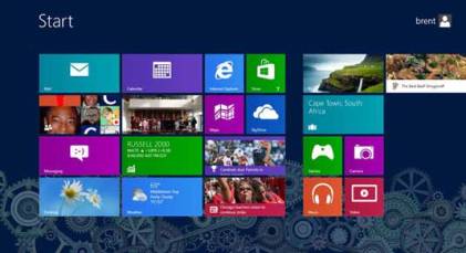
Development & RealisationFollowing up from my previous blog, i conducted further research into flat designs and their use. Our PAL leader introduced us to this approach by telling us it was a basic style of illustration which was commonly used in web design and app development. In an online article, Luke Clum (2014) explores flat designs by examining how rather than bringing aspects of real life to an interface, it illustrates a clear separation between technology and tactile objects. It follows a belief that if an aspect serves no functional purpose there should be no need to include it, it would be considered a distraction from user experience. Here is an example from Windows 8 which was the first major software using flat UI design to hit the market.
 Another well known developer to take on this approach being Apple with their latest software update, IOS 8 with the removal of the drop shadow, texture and gradient.

This style is inspired by minimalism however, as Clum goes on to say, just because it lacks any flashy design doesn’t mean this style is boring.The use of bright, bold colours help the illustrations pop from backgrounds and grab the users attention. In order to follow this approach the use of solid, vivid colours is vital. I aim to take this research on board when creating my poster, as i feel a minimalistic approach to the brief would help me effectively get the Star Wars family tree across whilst appealing to my target audience of young Star Wars fans.
Clum. L. 2014. ‘The Beginners Guide to Flat Design’. Creative Bloq. http://www.creativebloq.com/graphic-design/what-flat-design-3132112
